We Removed Our Hero Section — Here's Why
A cleaner experience that prioritizes value over conversion asks
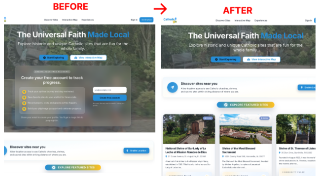
This week, we made a counterintuitive decision on CatholicGo: we hid the prominent signup card that greeted every visitor.
The result? A cleaner experience that prioritizes value over conversion asks.
The Problem
Our homepage opened with a large hero section asking users to create an account or sign up for our monthly pilgrimage guide. It looked great. It followed "best practices." But something felt off.
We were asking for something before giving anything in return.
The Data
When we looked at our analytics:
57% of traffic was mobile. The hero took up 400 pixels of prime real estate — particularly on mobile.
The hero was essentially a toll booth on a road users hadn't decided to travel yet.
The Shift
We implemented three changes:
1. "Minimal" hero mode. Instead of removing the signup functionality entirely, we made it toggleable via environment variable. No code deployment needed to switch between modes. This lets us A/B test and respond to seasonal needs.
2. Streamlined navigation. We moved from a cluttered nav to three focused items: Discover Sites, Interactive Map, and Experiences. About and Contact stayed in the footer — where users expect secondary links anyway.
3. Measurement infrastructure. We added GA4 event tracking to every navigation click, CTA, and auth interaction. Now we can actually answer: "Does delivering value first lead to more signups?"
The Philosophy
There's a tendency in product to optimize for the metric you're measured on. Signup rate. Click-through. Time on page.
But sometimes the best thing you can do for conversion is stop trying to convert — at least not immediately.
Deliver value first. Earn the ask.
Our users come to discover Catholic pilgrimage sites. Let them discover. The account creation opportunity is still there — in the navigation, contextually throughout the experience — but it's no longer blocking the door.
Once users mark a site as Visited or Want to Visit, we display a modal for account creation — this is when user psychology is at its peak and conversion is most likely.
The Technical Approach
We designed this as an experiment, not a permanent change:
Feature flags over code deployments: Changing HERO_MODE=minimal in our configuration switches the entire homepage experience. No engineering sprint required to test a hypothesis — we can revert in seconds if the data tells us to.
Measurement from day one: Every navigation click, CTA tap, and signup interaction now fires a tracking event. We're not guessing whether this works — we'll know.
What's Next
We're watching the data. If minimal mode increases engagement without hurting signups, it stays. If not, we toggle back.
That's the point of building with flexibility: decisions become experiments, not commitments.
What's your experience with "value first" vs. "capture first" approaches? I'd love to hear what's worked for your products.